Case Study Data Set
Data Visualization
Data Prediction
The Case Study is based on a hypothetical bank credit risk data set.
The data set contains 26 variables collected on 10,000 observations:
The goal of the Case Study is to analyze the data and to predict the Target Variable.
Click here to see the list of the variables of this Case Study, their possible codes
and their English Translation.
The present study is developed in R language.
R is an open source programming language specific for statistical data analysis.
In particular, the Case Study application is developed with an R package, “Shiny”,
that allows to build interactive web apps using R code.
The aim of the application is to visualize interactively the data
and the results of the analysis of the data set focused on the study of bank credit risk.
Among the models tested to predict the default indicators there are the following:
The developed R Shiny app is currently available at this web link:
https://dev1ratio.shinyapps.io/shiny01/
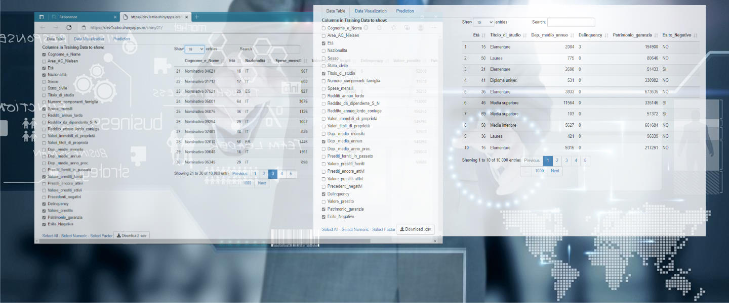
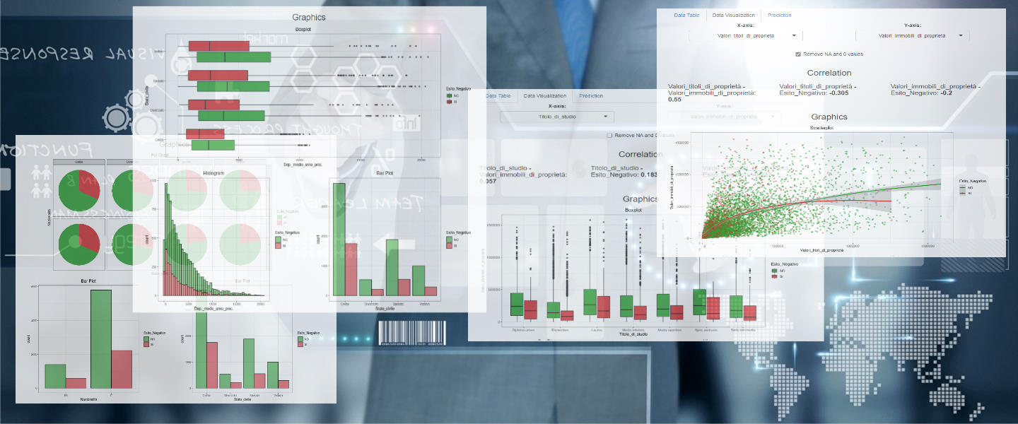
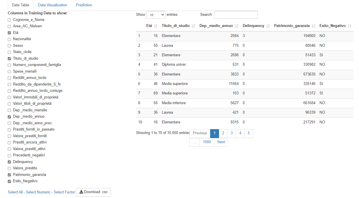
The app is composed by three pages/tabs.
The first page allows the visualization of the values of each column of the data set.
It is possible to choose the variables of interest,
the number of observations displayed on the screen (10,25,50,100)
and sort the columns into multiple levels.
It is also possible to download the data in .csv format.
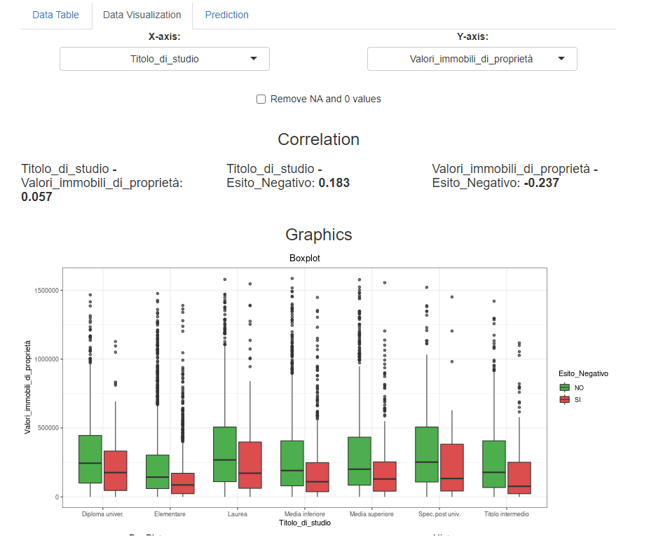
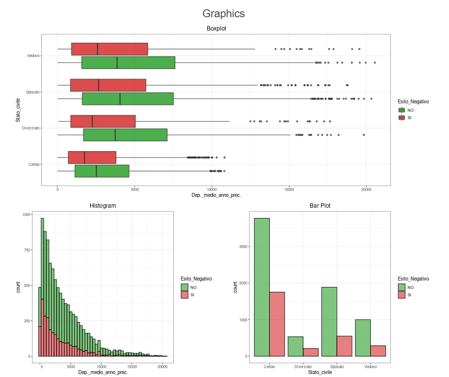
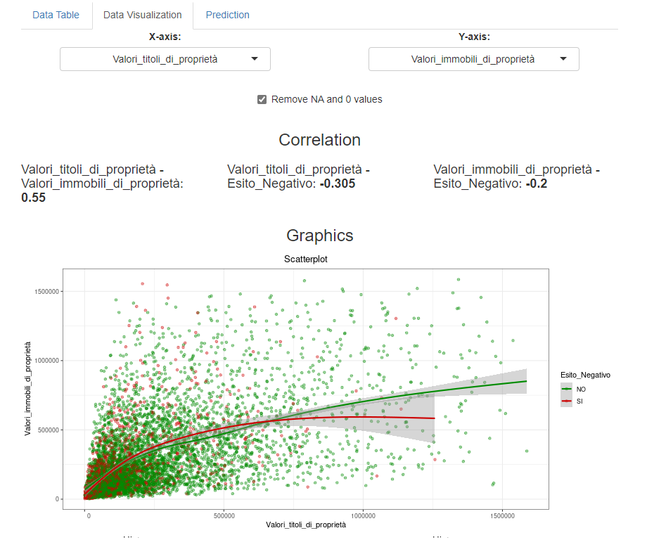
The second page allows you to consult the graphs and correlations (or associations)
both jointly between the explanatory variables,
and as a function of the "Esito Negativo" response variable,
that is always present in each graph.
It is possible to choose two by two the variables to be shown on the screen,
and graphs with marginal distributions and an appropriate joint distribution plot
will be returned
depending on the type of variables chosen (categorical, numeric or a categorical and a numeric),
always coloured according to the response variable.
Optionally, you can remove zero and missing values.

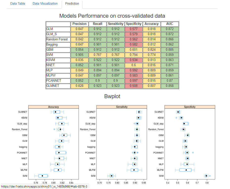
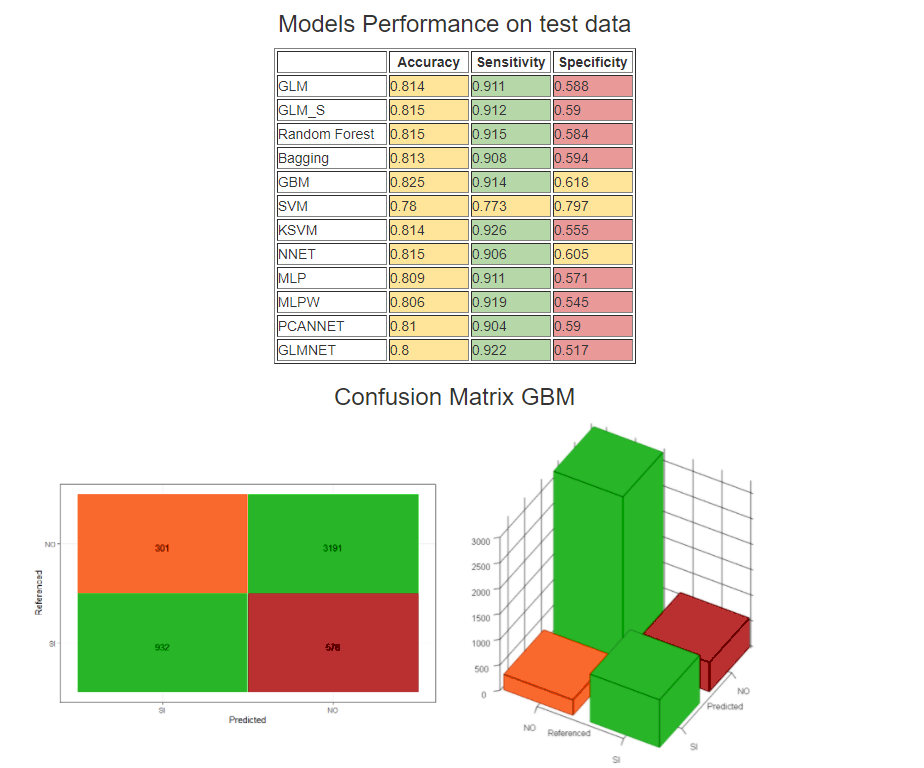
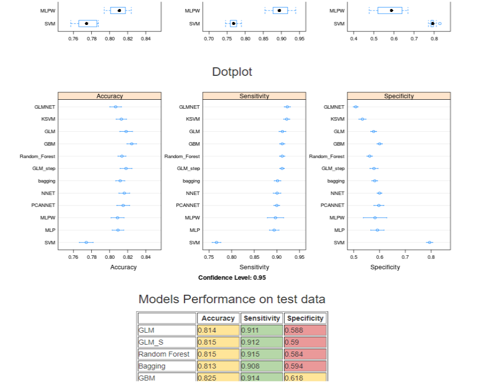
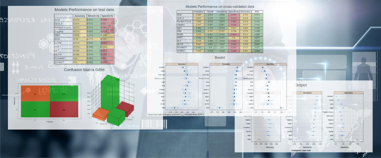
The third page shows the performance measures of some models
used in the training and forecasting phase.
Box and Whisker plots (bwplots) make a graphical comparison
between accuracy, specificity and sensitivity
calculated using a repeated 5-fold-cross-validation
and dotplots
that show the confidence intervals of the average of the calculated indicators.
Finally, it is reported the confusion matrix related just to the most performing model,
the GBM (Stochastic Gradient Boosting Model).