Case Study - Knime
Process Workflow
Data Visualization
Data Prediction
The Case Study is based on a hypothetical bank credit risk data set.
The data set contains 26 variables collected on 10,000 observations:
The goal of the Case Study is to analyze the data and to predict the Target Variable.
Click here to see the list of the variables of this Case Study, their possible codes
and their English Translation.
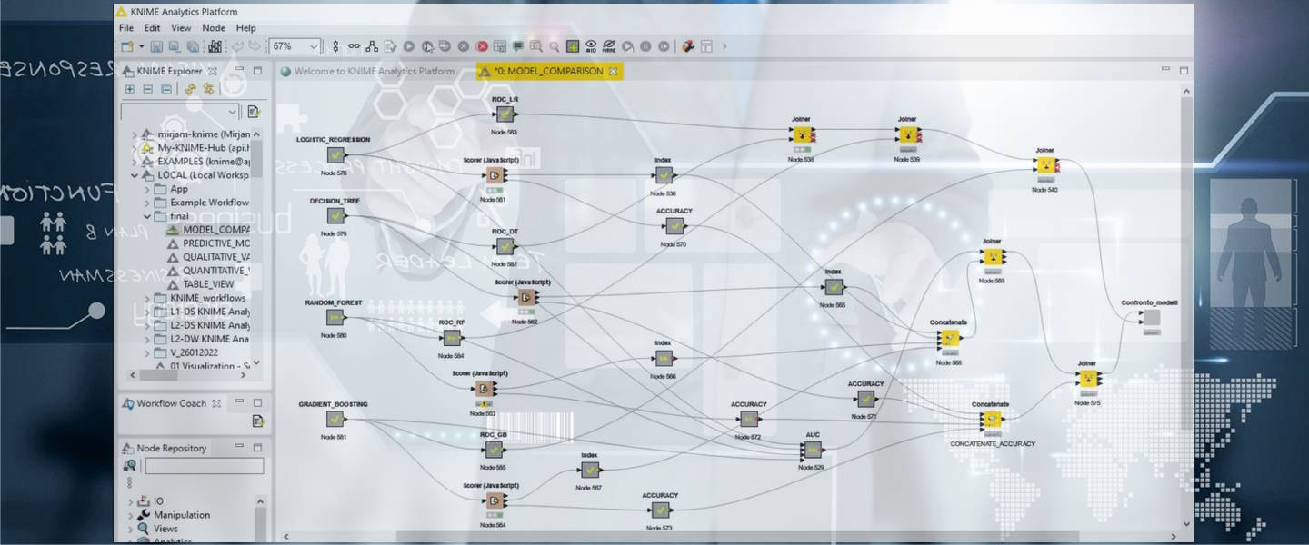
This Case Study is developed with Knime Analytics Platform.
Knime Analytics Platform is an open source software that builds analytical models, develops ETL processes and reports.
The aim of the Knime application, the dashboard, is to visualize interactively the data
and the results of the analysis of the data set focused on the study of bank credit risk.
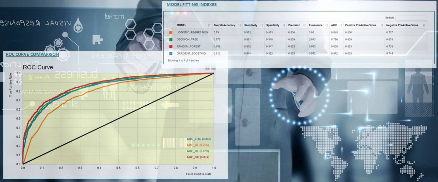
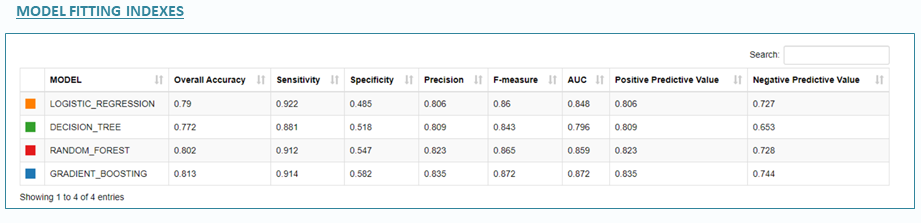
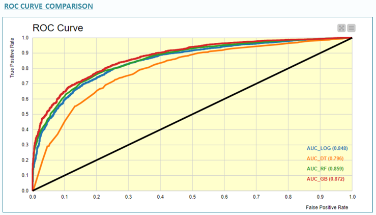
The analysis ends with a comparison among four predictive models, where Gradient Boosting gets the best accuracy in competition with Random Forest and Decisione Tree models.
In particular, this demo uses Knime to generate a WEB App with dynamic pages that
follow different Knime work flows and show different charts depending on the selected parameters.
Furthermore, it integrate models and code written with Python and R language.
Basically, the Knime app is composed by five pages:
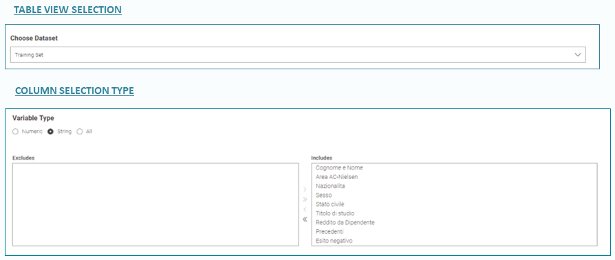
TABLE VIEW SELECTION, it allows you to select the data set to be visualized between training and test.
COLUMN SELECTION TYPE, it allows you to select the columns to be visualized among all the availables.
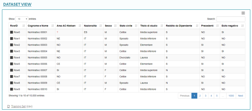
DATASET VIEW, it shows you the values of the columns of the selected data set.
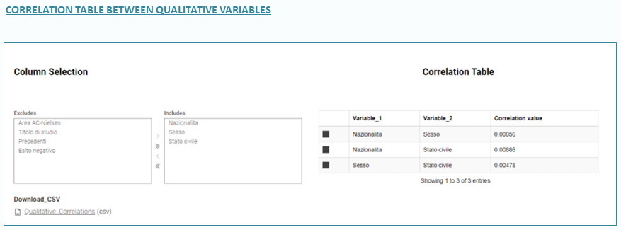
CORRELATION TABLE BETWEEN QUALITATIVE VARIABLES
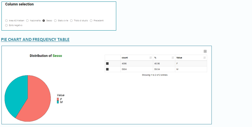
PIE CHART AND FREQUENCY TABLE
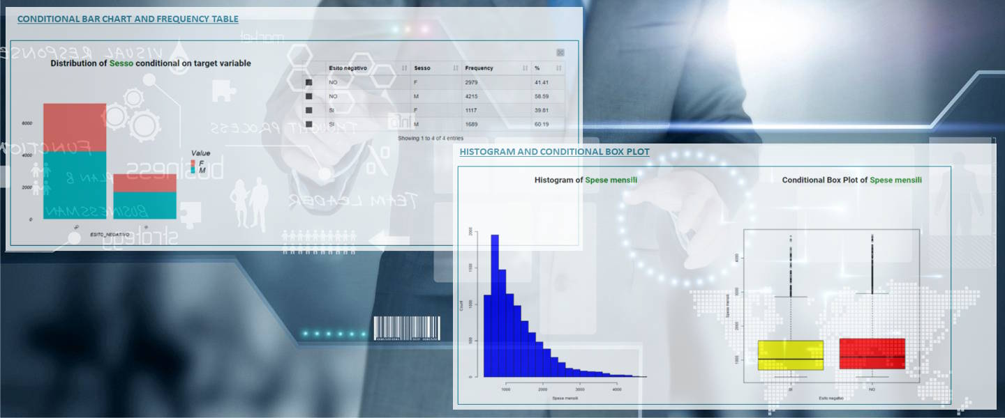
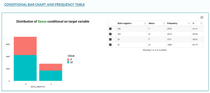
CONDITIONAL BAR CHART AND FREQUENCY TABLE
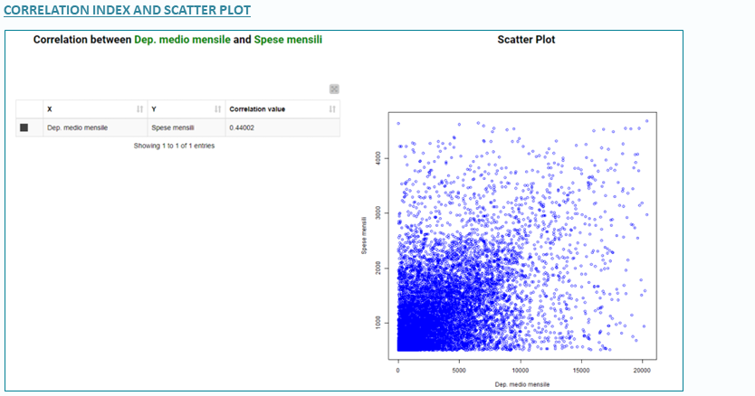
CORRELATION INDEX AND SCATTER PLOT
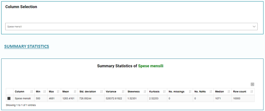
SUMMARY STATISTICS
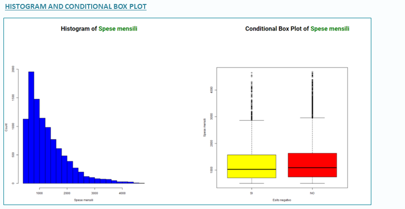
HISTOGRAM AND CONDITIONAL BOX-PLOT
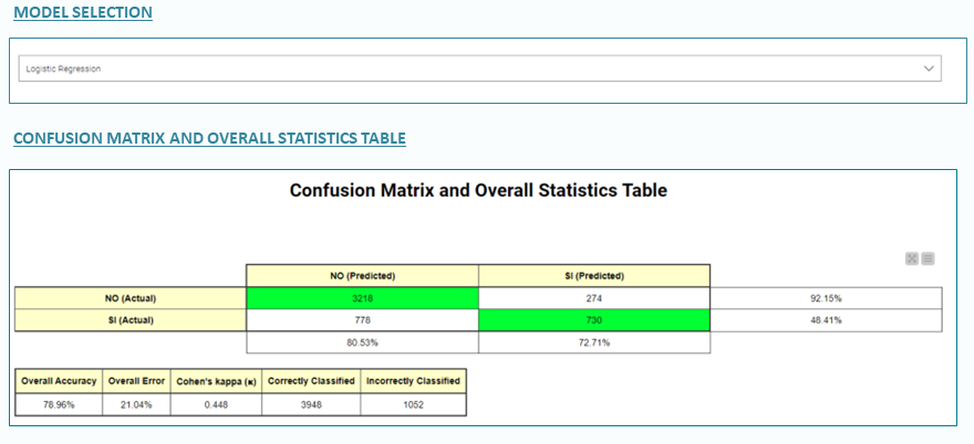
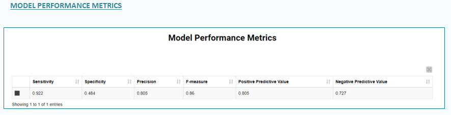
MODEL SELECTION
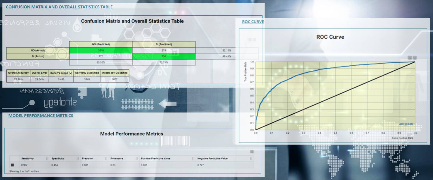
CONFUSION MATRIX
SUMMARY STATISTICS
HISTOGRAM AND CONDITIONAL BOX-PLOT
MODEL FITTING INDEXES
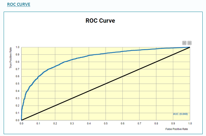
ROC CURVE COMPARISON
Among the models tested to predict the default indicators there are the following:
The app is composed by five pages here in details.
The first page allows the visualization of the values of each column of the data set.
It is possible to choose the variables of interest,
the number of observations displayed on the screen
and sort the columns into multiple levels.
It is also possible to download the data in .csv format.
TABLE VIEW: The page is composed by the following tabs:
Click on the video below to see the dashboard in action
for the visualization of the values of each column of a selected data set
and to see a quick view of the component data flow that generates and controls the dashboard.
The second page allows the exploration of the distribution and correlations measures
between categorical variables of the data set.
First you have to select a couple of variables to be analyzed.
You can also download the produced correlation table in CSV format.
Second, you can select one of the categorical variables listed under the first chart
to produce a pie chart and a frequency distribution.
QUALITATIVE VARIABLES: The page is composed by the following tabs:
it allows you to visualize the distribution of the target variable "esineg"
by the qualitative variable values
with a pie chart and a contingency table.
Click on the video below to see the dashboard in action
for the visualization of the frequency tables and charts of the qualitative variables
and to have a quick view of the component data flow
that generates and controls this dashboard.
The third page allows the exploration of the distribution and correlations measures
between numerical variables of the data set.
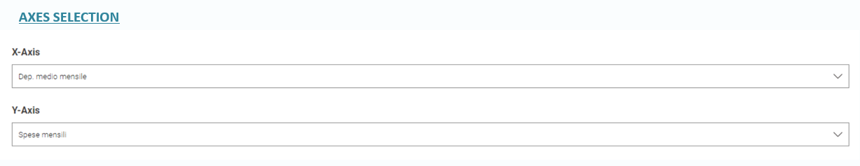
Charts and statistical tables are based in the first 2 variables selection as AXES
and a single variable to analyse its distribution respect the
response variable "esineg".
You can also download the produced correlation table in CSV format.
QUANTITATIVE VARIABLES: The page is composed by the following tabs:
Click on the video below to see the dashboard in action
for the visualization of the stats, correlation indexes,
and the charts of the quantitative variables respect the target variable "esineg",
and to have a quick view of the component data flow
that generates and controls this dashboard.
The fourth page allows the analysis of the model results.
To analyse the results and performance of a model
you just have to select it from a list box selector.
PREDICTIVE MODELS: The page is composed by the following tabs:
Click on the video below to see the dashboard in action
for the visualization of the stats, correlation indexes,
and the charts of the quantitative variables respect the target variable "esineg",
and to have a quick view of the component data flow
that generates and controls this dashboard.
The fifth page allows the comparison between all models produced by the dashboard
including the naive model.
Single model indexes and ROC Curve are the main methods to proceed with the comparison activity.
MODEL COMPARISON: The page is composed by the following tabs:
Click on the video below to see the comparison of all the four models.